css查漏补缺之十-floats
/ / 点击 / 阅读耗时 3 分钟浮动的结果
float本来是用来在一块文本中浮动图片的,多行布局交给了flex和grid,链接中的文章就是从这个角度来介绍float的。
浮动元素会脱离正常流。
浮动只会在元素所在的原始行开始浮动,并不会像position: absolute“浮的”那么彻底。
the element with the float set on it is taken out of the normal layout flow of the document and stuck to the left and side of its parent container. Any content that comes below the floated element in the normal layout flow will now wrap around it, filling up the space to the right-hand side of it as far up as the top of the floated element. There it will stop.
只能通过给浮动元素的一侧添加外边距来调整浮动元素和环绕它的文本的间距。
清除浮动
使用clear属性,可以取得值有:
left
right
both
clearing boxes wrapped around a float
如下代码:
1 | <div class="wrapper"> |
1 | .box { |
然后就会出现图片中的布局:
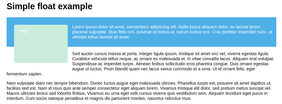
造成这种结果的原因是浮动元素脱离了正常流。想做到文本在浮动元素旁边排列且外部盒子能包住两个元素,靠给文本添加清除浮动是无法做到的,只会导致文本另起一行。
解决办法:
- clearfix hack
实质就是在wrapper后面添加内容,并两侧清除浮动。
1 | .wrapper::after { |
- 使用
overflow值非visible
实质是这个属性让wrapper成为了一个新的BFC,而BFC在计算高度的时候会包含浮动元素。
- 使用
display: flow-root
专业的做法,实质也是创建了新的BFC。
全文完。